3.9. The relationships between parameters - graph XY
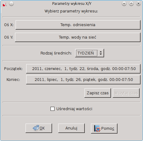
In Draw 3, you can specify the correlation of selected parameters. They are used for the charts XY. You can create one by choosing File and XY. By default, the graphs X and Y will be selected first two charts dimmed with the current system. Also, the time range is set to that of the current system.
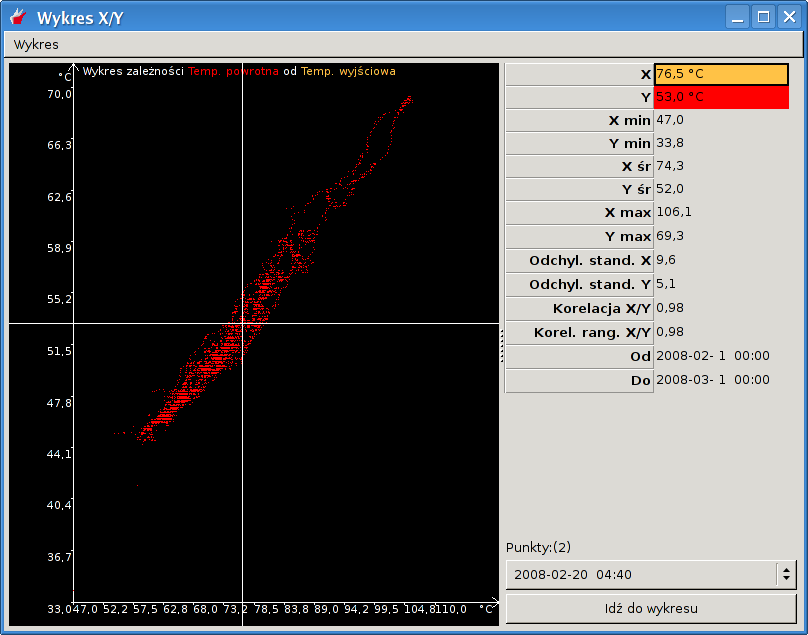
In the next chart XY, the right of the page, are placed more detailed information on the parameters shown in the graph:value at the selected point chart
the minimum, average and maximum in the given period of time
standard deviation
correlation between XY - shows the Pearson correlation coefficient - this ratio is set to the proximal 1 or -1, the more the parameter X-values are linearly dependent on the value of the parameter Y
The ranked correlation XY - The ranked correlation between the value the greater the more the values of the X and Y satisfy the relation monotonicity, so the more the condition that the increase in the value of the parameter X is accompanied by increase in the value of the parameter Y. The ranked correlation measures the more general relationship between X and Y parametarmi than Pearson's coefficient of correlation the ranked as adopted by a large enough value to increase the value of one parameter accompanied by any increase in the value of the second parameter, in the case of Pearson's coefficient also increase must be linear
date range for which you create a chart XY
number of samples that are displayed in the desired location on the chart
a list of the above mentioned samples
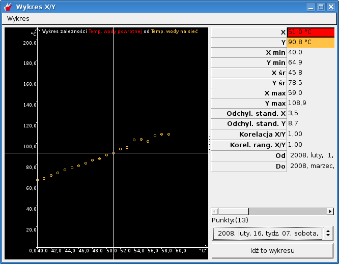
If the definition of an XY chart averaging the values you choose, you get a graph similar to the following:
Note!If you select the wrong period of time (for example, you will want to plot the data for the next month), the program will inform you of the error message: " lack of common data for selected charts in a given period of time ".
Parameters of chart XY can be changed by choosing Chart and then Change the parameters of chart . You can also quickly create a set of comprising forming a graph charts X / Y using the Go to chart . Kit can save and edit as a set of user parameters (more Sekcja 3.14).
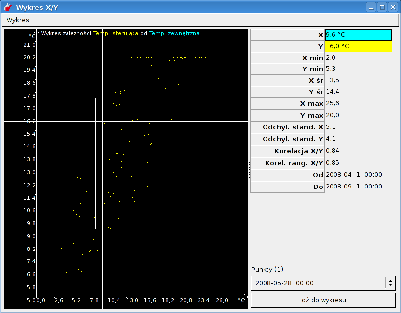
It is possible to increase or decrease the scale of the graph. To this end, the chart window XY while holding the right mouse button, select your area of interest and release the button:
To return to the original scale choose Graph and Zoom graph or use the keyboard shortcut Ctrl +- .
XY charts can be printed by choosing File and Print or using the keyboard shortcut Ctrl + P (more of the same print you can read in Chapter Sekcja 2.10). In print, in addition to the chart, are also described parameters describing the plot.
Option Averaging value introduced for compatibility with previous version of the viewer. It causes a breakdown of the range of values chart horizontal (X axis) for up to 24 areas in which the value of Y are averaged.


